Logos
Starting your Brand
Logo Design
Design for the Future
Your Logo Design is the absolute foundation of your company's Brand!
We focus on:
1) Incredible Readability for long distance impact
(Signage and Vehicle Graphics provide maximum return when readable from FAR away!)
2) Unique Styling
Brand differently to stand out as the ONLY ANSWER to your customer's needs.
3) Versatile Design
so it works in as many uses as possible, and
4) Timelessness
so you look fresh and current, and don't fade out of mind.
Some formats like: Embroidery, Screen Printed Clothing, and Vinyl Decals can sometimes be problematic because of limitations of those mediums. If possible, we design to avoid any problems so your Brand is as consistent as possible!
* All this goodness nets you more awareness and boosted professionalism.
* We work with you, to make sure your Logo (new or re-branded) works everywhere you need it to.
Harness the power of clean, unique, versatile, and timeless custom Branding!
More on Logopond

- Clean |
- Modern |
- Adaptable to Many Formats |
- Memorable |
- Unique |
- Timeless
Caroline Homes
Caroline came to us looking for a couple of different Logo options. We designed a few character style Logos, but ended up going with a more streamlined red roof/red horse design that’s similar to a business partner’s Logo for stronger Branding cohesion between the two companies.
*Click for FULL SIZE!
Bearded Viking Games
Caleb came to us looking for a re-brand of his YouTube channel. We had a group brainstorm and decided what's cooler than Bearded Viking? Nothing! So we designed a unique Bearded Viking graphic, complete with Bearded Viking type-treatment, a Viking Ship, and a cool Brand. It’s a responsive Logo system that scales back to the simplest form when the more complex Logos may not work well.
(Viking graphic Logo -> Text Logo -> then the “BVG” Brand)
The ship is a complimentary branding element.
*Click for FULL SIZE!
Hawthorne Hellbenders
Logo Design for a Sports Team Brand. We had to have that big impact, in your face boldness characteristic of quality Sports Logos. Created a fresh concept by combining an old Middle-Ages Crusade metal helmet with some barbed horns, light reflections, and nice shading. And what other colors would you possibly choose for “Hellbenders” better than wicked shades of Red?!
Brandon Illustration
Brandon was looking for an illustration of himself for a personal project. We designed this graphic for him, and you should have seen his face when he saw it! (Actually... it looked a lot like this before he erupted into a joyous laugh!)

Acker Construction
Kris was looking for a unique Logo that wasn’t going to blend in with all the “cookie-cutter” Construction Logos around Amarillo. He was quite pleased with this guy, we also made quite a few Vinyl Decals with this Logo for his work Truck and other vehicles, as well as some custom Acker Construction shirts!
Bear Essentials
Outdoorsy Camping Brand. We wanted to portray the rough, charismatic, and natural vibe of their company. They are a no-frills, just quality camping gear that does what you need it to, kinda place. Just the “Bear Essentials” if you will. Check out the big brown bear and bold, yet characteristic type we designed. Used over a yellow background for an inviting and friendly feel.
Amarillo Inn & Suites
Logo concept for a local Hotel re-brand. We aimed to portray Amarillo Inn & Suites as a friendly atmosphere for both local and traveling guests to stay. Red, White, and Blue portray both the Texan, and American heritage of the home-grown Hotel.
Grills Gon' Wild
We collaborated with Grills Gon' Wild, a Local Restaurant on the south side of Amarillo, to design their Logo and get their Brand kick-started. Designed after processing the pros and cons of competitors Brands and assessing what we could do and how to do it better, this was our final result. Serious but playful with warming character and charisma. Strategically leveraged to be unique, more readable, more inviting, and psychologically optimized with color theory and design style aesthetic to attract their target market better than the competition for optimal Branding success.
Crafty Cabins
Sometimes we even get to flex our art muscles and do a little painting for a really hand-made vibe. Exemplifying the human element of the Crafty Cabins Brand, we opted for a truly hand-brushed Logo to set them apart from the sterile “suite-and-tie” appearance that is common in the construction industry.

Texas Thunder Sauce
While three great friends were forming an alliance, and Texas Thunder Sauce was firing up it's line of BBQ sauces, we were honored to help design and cultivate their Brand. We helped them craft their Logo, Sauce Labels, Flyers, and Business Cards. Texan heritage, thunder, barb wire, and southern hospitality all came together to set their jars apart on the shelves.
2-Play Gaming
2-Play Gaming recently reached out to Octane Studios to build their brand from scratch. They wanted to pay homage to old school 8-bit and 16-bit video game style, while incorporating a fresh new look. We carried the brand through all their Social Media (Facebook & Twitter) and YouTube pages by designing complimentary brand-enhancing graphics.
Ascension Outdoor
For a full-outdoor sporting goods store. Since mountaineering, canyoneering, and most other outdoor adventurous treks aren’t for the faint of heart, we didn’t want a Logo that was faint either. A rough and abrasively textured mountain ridge with a flag on top of the biggest and baddest mountain around. Because when you go with Ascension Outdoor, you’re gonna make it to the top. For gear that stands up under utter abuse in even in the harshest of climates.
Hotrod Haven Trucks
It was great working with Hotrod Haven trucks to design their logo. They were looking for something edgy and energetic to really grab attention. Readability was still important, as we were also commissioned to cut several vinyl decals for them to distribute to followers. We helped position their brand against their competitors in an effective way, stayed true to their style, and sized decals for greatest impact at lowest cost.
Redneckfest 2014
Back for more! Redneckfest 2014 took a new branding approach with more illustration and hand-crafted lettering. I worked with them to come up with an effective color coded branding scheme that worked quite well. We we worked closely together to design the Logo, Vinyl Decals (used on various door prizes and auction items), T-Shirt design, and an appealing Ad-Campaign.
Triangle RV Park
Triangle Electric conctacted us to design a logo for them to use for their RV-Park, and they wanted to keep the same triangle graphic that I designed and branded their electric company with. So we used the same font as well as date of establishment to keep the branding in line. Rock on.
Buckwheater District
For a street-wear clothing company in Malaysia. We incorporated vertical bars on the left side that grow into the "B" to show how the company is growing, and to indicate the importance of music in the brand's culture. One color, highly adaptable to many formats.
Big Bird Gaming Inc
To design the Big Bird Gaming Inc logo, I worked closely with them to decide what style and direction we were shooting for. Making sure it would fit all of their specified usages and be a flexible and powerful brand. The secondary logo (on top) is used in smaller areas that the main logo (on bottom) won't work as well.
Attorney Dean Boyd
The Strong Arm
When re-desiging Dean Boyd's branding image, we kept the concept of the metal texture (as seen in his commercials), but put a fresh spin on it. More refined and professional. To further his "Strong Arm" brand, I made sure even the letters themselves emulated a fist shape.
Brooke Sanders Hair Stylist
We designed Brooke’s logo in a modern and fresh approach to blend in with her employment at Wade Gordon Hair Salon in Amarillo. Utilizing black and white, we added a splash of red to her brand. Check out the Facebook page branding we did for her.
(just click the logo)
Maverick's Automotive Garage
Logo for an auto shop, we took inspiration from old school oil cans from the '30s, 40s, and '50s. Metal cans with stark high contrast emblem logos. We added a little gritty texture to make it fit the profile of an aged antique even more. A humble and inviting brand.
Farmers of the Texas Panhandle
Farming Association to bring local farmers together. We decided to go in the direction of a simple stamp as would be used on crates of fresh produce. What resulted was a clean and highly use-able design that will work in pretty much any and every format.
Organica
Natural Gas company, Organica strives to be as green as possible; reducing paper and plastic waste while providing the world with fuel. The dot above the “I” is a die-cut flame. Green for recycling, orange for combustion of fuel for energy.
Dwight Brothers Carpentry
Jerry and Stanford Dwight are carpenters with a long family history of woodworking. We designed this logo to serve as a simple crest for their company. The thick and thin fonts stand for the interplay between the large and small works they create in their workshop.
Undefined Snowboards
A stark and highly adaptable logo. Extreme sports brands must be bold and powerful. The arrow mimics a compass pointing North (where you will most likely find mountains, snow, and snowboarders). It is also an abstract symbol for positivity, reflecting their slogan: “No Boundaries.”
Redneckfest 2013
Back for more Redneck action! This year we designed two logos, the top a main design for the T-shirts. The bottom is a secondary design that was used on the back of the T-shirts and on various vinyl decals used to brand the event. We decked out some really cool looking mini fridges as raffle items and used the secondary logo.
Woody's Auto Works
A parody of Woody Woodpecker for an auto-collision repair shop in Amarillo, Texas. The client requested a more aggressive version of the cartoon character we all love. It utilizes a two color design to keep signage and shirt printing costs under control.
Travesty Gym
Modern and minimal. The gym requested a clean logo that would be applicable in many formats. We decided on a single color mark that is memorable and easily used in many different mediums ranging from: gym bags, apparel, workout equipment, signage, printed marketing materials, online, and more.

jsbeU
(Just Be You) is a logo for a hip twenty-something women’s apparel company. The brief called for a fresh and inviting design for young women: not too safe, but not too crazy either. Beach life is a strong part of the business brand. We incorporated a palm tree into the logotype to reinforce this idea.
Triangle Electric
Clean, modern, highly readable, and powerful. We emphasized the 3 generations within the company by the 3 "slices" in the triangle and again by wrapping a secondary triangle outide the main. Thereby creating an optical illusion of 3 triangles.

Sentinal Records
A stout, mechanical, almost robotic, clean, and easy to read logo. The type should look like it was made out of titanium. “Do you remember The Terminator?” Yeah. Something awesome like that.
City On A Hill
Apparel company logo. This is the full version of the logo, we also designed a minimalist version created for small and one-color usages. Hover over the image to see the secondary version. Large skyscrapers were used in the full logo to strengthen the company’s urban clothing brand.
Redneckfest 2012
Annual event that I have been branding for a few years now. In 2012 we branded the event as a parody of the NHRA drag racing logo. 2 colors, easier to screen print on T-shirts, and make vinyl decals for raffle items. (Mini Fridges, Coolers, etc)
Tumbleweed-Mfg
Industrial logotype without any identifying icon. Ability to be used in a variety of different mediums. The elongated letters create a strong framework for the logo that emphasizes the metal fabrication brand.
Apache Concrete
A serious logo that’s warmer and more inviting than that of their competitors. Orange was used as a powerful attention-drawing color. The contrasting fonts assist in making the logo more visually appealing.
Shield Cyclists
A striking one color logo with negative space. The complementary branding color is yellow. The banner “shields” the pedal and gear, just as this nonprofit “shields” cyclists by advocating safe travel practices for both motorists and cyclists. There is always hope for a safer tomorrow.
White Done Right Teeth Whitening
A soft blue lends itself to the caring nature of the business. Most teeth whitening procedures are actually painful to patients. White Done Right has a secret weapon that eliminates the pain completely.

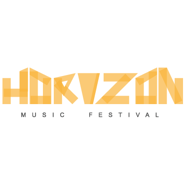
Horizon Music Festival
Horizon is an annual outdoor music festival. A variety of musicians perform outdoors in a canyon during the summer. We took the idea of an outdoor festival and incorporated the jagged rim of the canyon into the type for this logo.
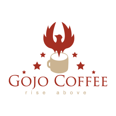
Gojo Coffee
A rich and sophisticated coffee logo. We avoided the cliche brown color scheme and went with something a little different; a deep red to convey a rich roasting background and a light tan to emphasize a variety of unique coffee blends.
Needing a quote? See the PDF below and email your answers to me. I'll get back to you soon!
**
Logo Design Questionaire - PDF
Have a logo, but wanting to take your company's marketing farther? We offer Branding and build Dynamic Websites to set you apart from your competitors. Contact Us for a free quote today!
Like what we do? We follow a rigorous process to consistently deliver quality work. Click the button to see what it is. The right answer might not be obvious. But we’ll find it.
